Taskbox Taskbox Taskbox

SCROLL
We kicked “TaskBox” website into top gear
Start: Jan 08 - End Sep 12
brand
TaskBox
LOCATION
Reykjavík, Iceland
CLIENT
Genki Instruments.
BUDGET
Confidential
INDUSTRY
Technology
Services
Product Strategy
UI/UX Design
Logo Design
Brand Strategy
Live
Check Live
The previous website got old, and it didnt match Genkis ambition. It had an overly flashy, gadgety, and sometimes infantile look, which was in stark contrast to the values Genki wished to communicate: professionalism, maturity, and innovation.
We came up with a plan for a minimalistic, state-of-the-art Shopify-based headless website with carefully designed UX/UI, toned-down backgrounds, and eye-catching icons & typography. The goal was to achieve a professional yet welcoming mood, all without overwhelming the user.

In the spirit of a slightly clichéd, albeit still valuable slogan less is more, weve designed and built a mature, clear, modern; simple-yet-engaging headless website with an integrated, custom e-commerce platform to give Genki the extra edge over their rivals.
The result of the work
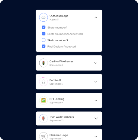
A Product with a human touch
A unique and minimalist product called for a clean and modern website, which immerses you with smoothness and fluidity of human motion, reflecting the features that distinguish their products. The goal was to guarantee the brand a professional look, without overwhelming the user with a feeling of being crushed by the amount of data. Our project encompassed an entirely new headless website, a blog feature, and a functional, custom e-commerce based on Shopify.

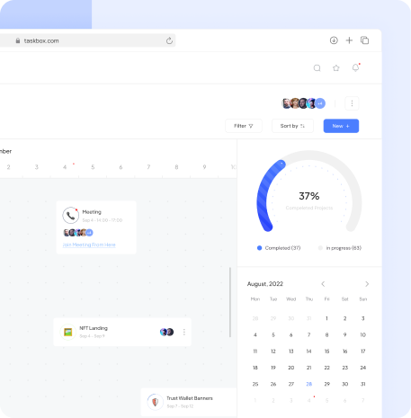
integrated video
Works best in motion
The unique nuances of Genki wearables are easiest to grasp when viewed in video form. Its no wonder that the website utilizes the video format extensively, offering an emotive addition to product and description pages, as well as an option to take a look at what the product performs and operates like in practice.

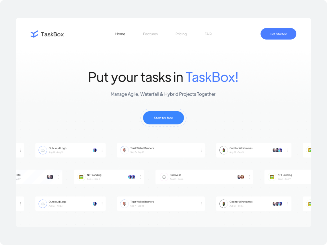
Design Style
Elegant & minimalist
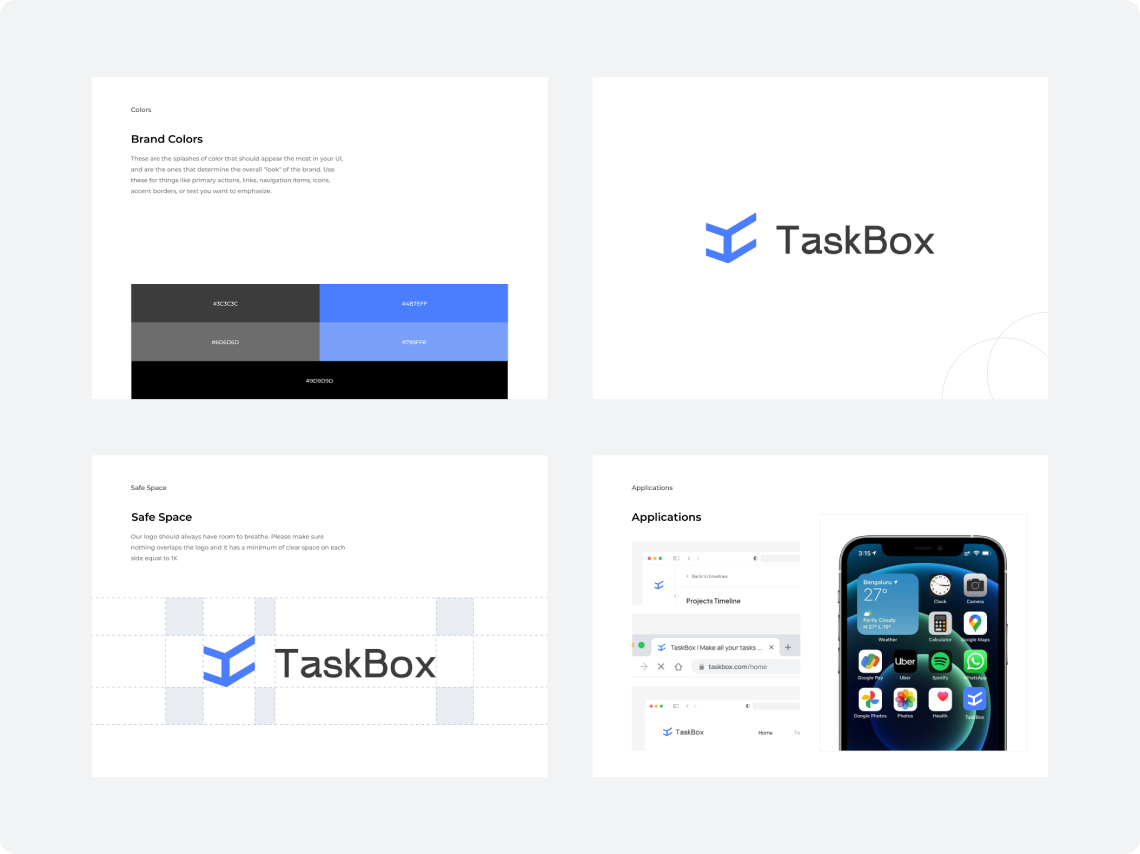
The website grasps the users attention by alternating between several backgrounds and text color combinations. We went with a striking blood-orange, bright gray and a trusted black & white contrast to ensure optimal readability, as well as a compromise between energetic maturity and captivating, joyful design.

Keep in touch !
Call@shift.agency
Contact Page
feel free to contact us, and talk about your project to collaborate with us.